
A website is the most important factor that can either make or break your business. A well-designed and functional website is the utmost requirement for a business to gain new and more customers, establish brand credibility and foster client relationships. The main purpose of creating a website is to provide its users with the best possible experience while allowing them to take the desired action.
Having a non-functional and poor website can land your business in hot waters. Unfortunately, many small business owners fail to grasp the ABC of web design and development, leading to a website that is cluttered and underperforming.
If your website is not getting enough traffic and leads, it is high time to take a close look at your website design strategy and make some important tweaks to get it right. Here are 7 most common web design mistakes every small business should steer clear of to help you attract qualified leads.
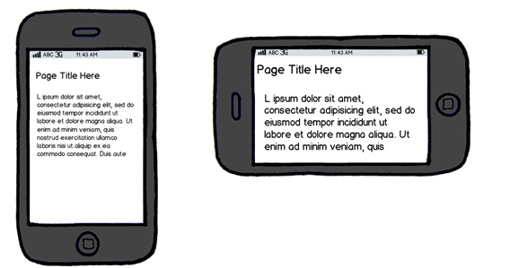
1. Poor Mobile Site Experience
It is one of the biggest web design mistakes that every brand should avoid if they want to stay ahead of the curve. Today, more and more consumers are using their smart devices at a rate higher than desktop screens. In fact, more than 60% of searches are conducted on smartphones and tablets.
If your website isn’t mobile-friendly, chances are that your customers will prefer your competitors’ website to fulfill their needs over yours. Make it easy for your website visitors to find their desired products or services from their handheld devices. Create a responsive web design for mobile to provide an optimal user experience and improve your search engine rankings. According to the latest Google algorithms, a mobile-friendly website that provides a seamless experience across all screens can lead to a significant boost in their search engine rankings. Mobile-friendliness matters a lot, so if your website is not mobile-optimized, make sure to tweak it.

2. Poor Readability
A well-designed and functional interface design has the potential to grab users’ attention but what’s the point of creating a great web design when users are unable to read the useful information they desire. Poor use of fonts is the most common web design mistake that can make website visitors leave your website immediately. It is advised to pay careful attention to the fonts you choose as they truly convey your brand image. Make sure to choose the most legible and attractive fonts that are reader-friendly.
3. No White Space
Many web designers overlook the importance of white spaces and try to cram every nook and cranny of pages with elements. Such pages eventually end up appearing cluttered and illegible. It is recommended to incorporate whitespace in your web design intelligently to catch the attention of users and make large images and text less intimidating.

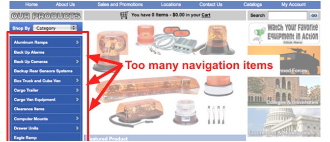
4. A Terrible Navigation
It is another common web design mistake that it only takes a few seconds to break your brand image. Keep in mind that the navigation of your website should be seamless and enable users to find the desired information. When it comes to creating the navigation of a website, it is suggested to take your customers’ needs, interests and questions into account so that they can easily find the desired information.
Since there is no magic formula for creating a website navigation, it is crucial to understand that your navigation menu must be consistent and intuitive. Your website homepage should incorporate imperative links such as business hours, product stores, FAQs, shipping details, contact details, social media links, brand story, return policy and more. In addition, adding a search bar is a handy tool to place inside your header. In a nutshell, organize and structure your navigational layout in a way that provides a seamless user experience while making people stick around your website longer.
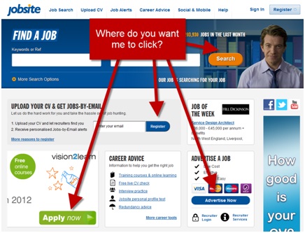
5. Annoying and Confusing CTAs
Believe it or not, a persuasive CTA can turn visitors into leads. It persuades users to take the desired action. Therefore, it is important that your website should be replete with enough information for your visitors and clearly describe the value of your services or products complemented with catchy phrases that prompt action. Remember that there is a fine line between being helpful and being irritating. Make sure that your CTA is simple, to-the-point, convincing and informs visitors exactly what their next step should be.
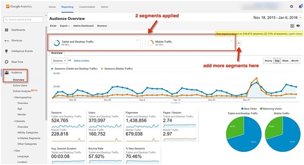
6. Not Using Analytics
Most small businesses and marketing agencies fall in to the same trap. Unfortunately, less than 30% of small businesses use an analytics tool to track their website performance. Regularly check your website analytics as they impart a lot of valuable information about the behavior of your consumers, and their interests while allowing you to track conversions and make tweaks in your web design and marketing strategy to provide a personalized user experience that will eventually bring in more customers.
7. Annoying Background Music
If you want to create a website that generates more qualified leads and retain customers, it is advised to not integrate background music on your website. Sadly, a large number of web designers don’t care about the background music on their website. They make it more irritating by using different sounds on individual pages. Avoid using background music at all costs, however, if you do wish to play music on your website, don’t impose it on your users; let them decide if they want to listen by displaying play, pause and volume control options on your website. This way, they can turn it off or pause whenever they want.

To Sum Things Up
When it comes to creating an out-of-the-box website design, always keep the needs of your target audience and brand image in mind. With diligent planning, detailed research and challenging work, you can come up with a visually appealing and functional website that speaks volume about your business. Hiring a professional web design agency is a sensible decision to ensure that your website is devoid of all the common web design mistakes.

