Suppose you have managed to pull out significant traffic to your website. Can you count it as success? Yes, you have succeeded but only partly. Remaining half of the success depends on how good you are at capitalizing that traffic. Any traffic to your brand is useless until there are successful conversions taking place. That is, how many of your audience reaches the end of the sales funnel – from just being a visitor to an actual buyer.
Are you well-equipped with all the turns and tricks to boost up your conversion rate? If not, then look for the top 5 methods below.
1. Carefully craft your landing page
The quality of your landing page can drastically improve the conversion rate. On average, a landing page takes 8 seconds to make an impression upon the viewer. So you don’t have much time to impress your audience. However, if you stick to the following checklist, 8 seconds are more than enough to hookup any potential visitor.
- Engaging headline: A compelling headline is the first pre-requisite of a good landing page because that’s what people notice before anything else. So the first impression has to be right on the money.
- CTA button: Make CTA as visible as possible. Use a color for CTA that pops out on your page so people don’t have to search for it. Keeping this in mind, it would be best to use the color which is prominent enough.

The above picture shows the green CTA button stands out because the same color has not been used anywhere else in the background.
- Targeted copy: After reading an attention-grabbing headline, people would want to know what you have to offer. Generally, visitors show more interest when they read the word “free” somewhere in the copy. You can create a sense of urgency by limiting the offer to a certain duration. That way, people are more likely to feel that they will lose something good by not accepting your deal.
- User-friendly form: The average number of fields on a landing page form is 11, but many people avoid disclosing too much information. That’s why having 4 form fields can increase conversion by 120%. Moreover, mere looking at the form makes people run away, so companies use them as fill in the blanks.
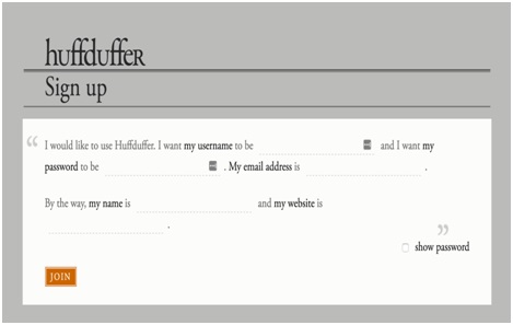
As you can see, this is undoubtedly an interesting outlook and people are more inclined to fill them.
- Add videos: Adding videos on landing pages has become a norm. One rarely sees a landing page without a well-edited video. Add a relevant video that spikes the interest of the audience.
2. Introduce chatbots on your website
A study predicted that by 2020, customer service will be more important than the product and its price. Therefore, customer service has a huge role to play in a high conversion rate. Yet, at times, it is frustrating to contact a company representative. In some cases, it can even take long hours so the potential customer lose interest.
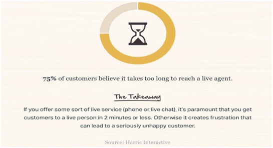
The above infographic shows high communication lapses between retailers and customers.
A few years back, only large companies having tons of resources could afford impeccable customer service to answer customer queries right away. But today, it is a different deal as small businesses can afford the same luxury with the help of chatbots.
About 67% of the customers around the world have used chatbots in last one year – this shows the growing popularity of this medium. What’s more is that millennials are particularly obsessed with chatbots.
2 out of 5 millennials believe that chatbots provide better customer service than humans. As AI continues to progress, chatbots will go through a lot of improvement, even personalizing the conversation to some extent.
3. Highlight phone numbers prominently
Providing your phone number on the homepage header is one thing that impacts your business rightly. It provides cushion to the viewers so they won’t have a hard time to trust you. Without having any means to contact, customers will be wary about your credibility in case anything goes wrong.
In this age, when scams are the order of the day, you have to go an extra mile to gain the lost trust of your customers. To attract more customers and retain the older ones, this tactic can improve your conversion rate. Be smart with the choice of font color.
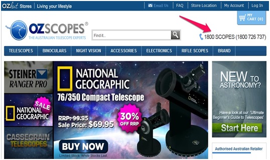
Nobody will have difficulty to spot the number if it is written clearly, as in the above picture.
4. Don’t fall flat for cheesy photos
A picture speaks volumes about a brand. That’s the first impression they get when scrolling through your webpage or content posted on social media. People are no more lured by good-for-nothing stock photos. They want the real stuff. So it should be your top priority to allow them to feel like they’re dealing with a human, not a machine.
As per this report, a website’s signups showed a hike of 35% when they replaced a stock photo with the picture of their founder. This is an example of how smaller things can actually work wonders in the business world.
5. Speed up your website
It is an often-quoted figure that the delay of mere one second can cut your conversion by 7%. Imagine if your website delays for a few seconds. How many customers will you end up losing?
Even if your website’s speed is fair enough from your perspective, think from the customer’s point of view too. For example, what if someone visits your site and has already opened dozens of tabs? The speed is not going to be ideal for him. Therefore, performing a site speed test is a must on regular basis because that’s the area where you can’t compromise at any cost.

